
Thin Ice
Momentum and breath give key insights into an extremely concentrated stock market.

If you find this article interesting, click the like button for me! I would greatly appreciate it :)

Is the stock market in a bubble? What does that even mean? First of all, the earnings and performance of the S&P 500 are driven primarily by the top stocks. The S&P 500 is cap-weighted, which means a handful of the largest companies determine most of what you see on the chart. The Magnificent 7 stocks (Apple, Nvidia, Microsoft, Google, Amazon, Meta, and Tesla) account for 35% of the index. This is already one sign of market bubbles, comparable only to 1929, 1972 Nifty Fifty, 2000 dot-com, and 1989 Japan.
The Mag 7 are the ones spending the capex, but the broader semiconductor complex and AI infrastructure names are the whole theme. The AI theme is now the core narrative propelling the market. Energy is an example of a sector that doesn’t matter, composing less than 4% of the S&P 500. Semiconductors used to be like that, but have since climbed all the way to a whopping 17.4%.

These stocks have been on a tear, with the SMH ETF up 60% in the last 45 days and up 238% since April 2025. These are extraordinary moves over a short period and are not representative of normal market behavior. Now that semis are acting like crypto or meme stocks and the AI theme is driving the market, it is important to keep perspective. SMH went down 80% in 2000 and 60% in 2008.
Under The Hood
Market breadth is a key technical indicator that measures how many stocks are contributing to the price rally. First, the overall momentum can be tracked with the relative strength index (RSI). Next, the McClellan Oscillator measures the momentum of the difference between advancing and declining stocks. If the market is rising but 90% of stocks are falling, that may not be a sustainable market rally.
This is a common sign before major market tops, which are typically harder to identify than bottoms. If the price of the market is going higher while momentum is declining, this is negative divergence, commonly preceding price declines.
In 2007, before the financial crisis, the S&P 500 pulled back 11% from the July high before moving to a new high in October. While this occurred, RSI momentum made a lower high, or negative divergence. Further, the market breadth shown with the McClellan Oscillator was also declining strongly, meaning fewer and fewer stocks were actually going up on that second rally.
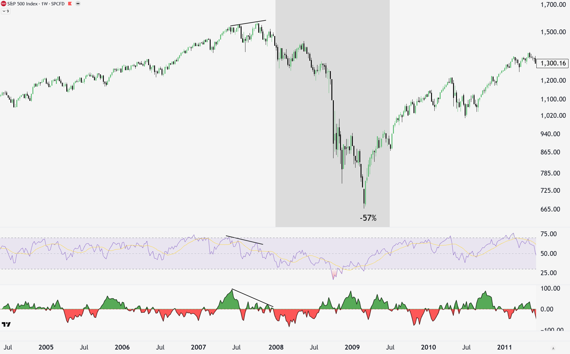
COVID came out of nowhere, but astute market watchers may have noticed some concerning signals ahead of time. The same negative divergences in momentum and breadth occurred in the months leading up to the big down move in Feb/Mar.
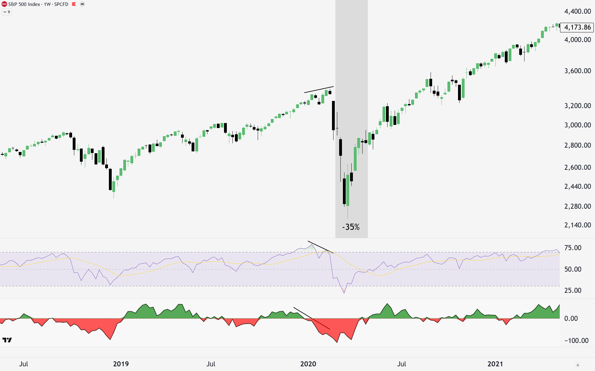
After an extremely strong and fast rebound from the 2020 lows, NFTs and memestocks were sounding a lot like bubble behavior. Yet again, momentum and breadth showed negative divergence before the 27% decline.
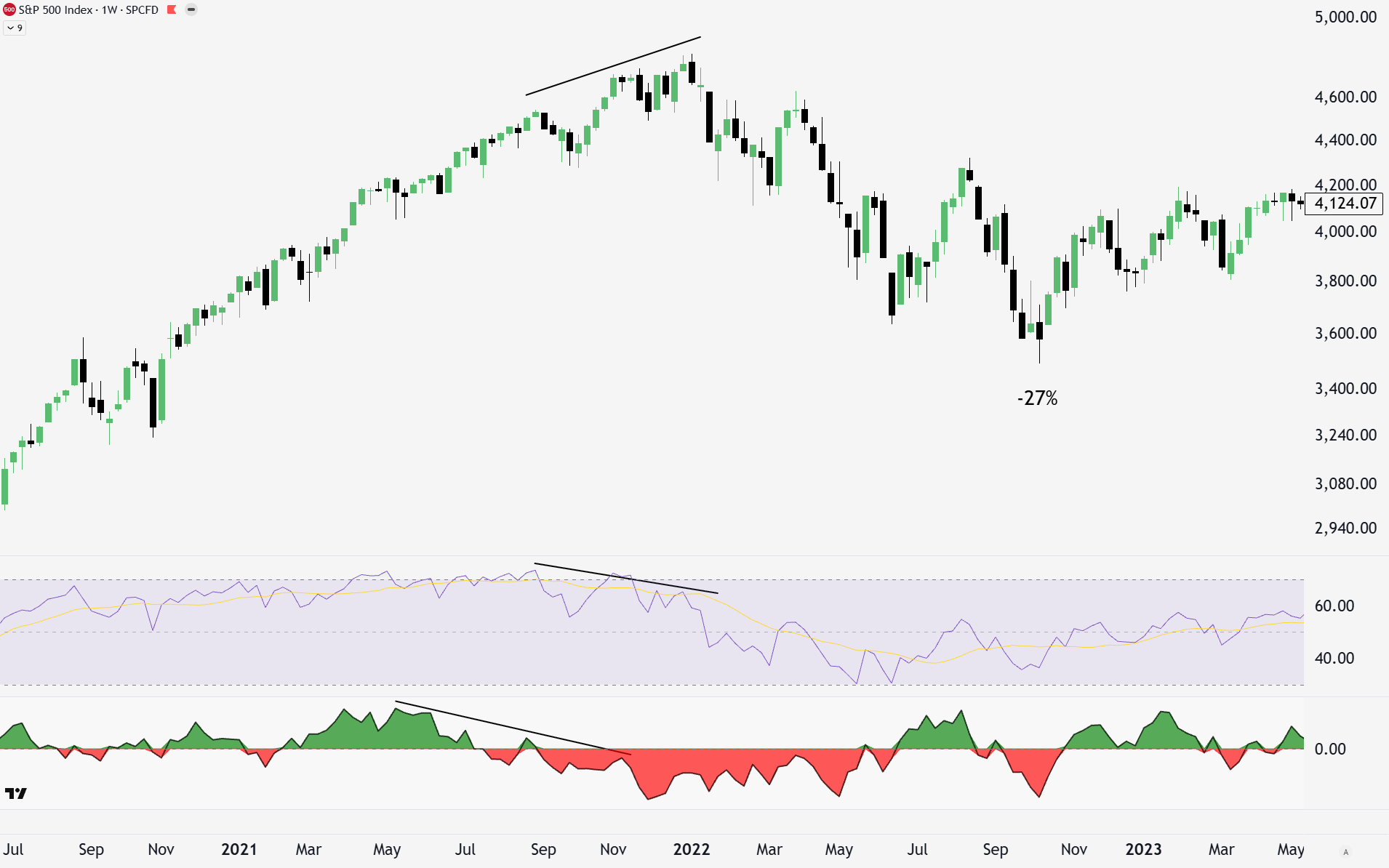
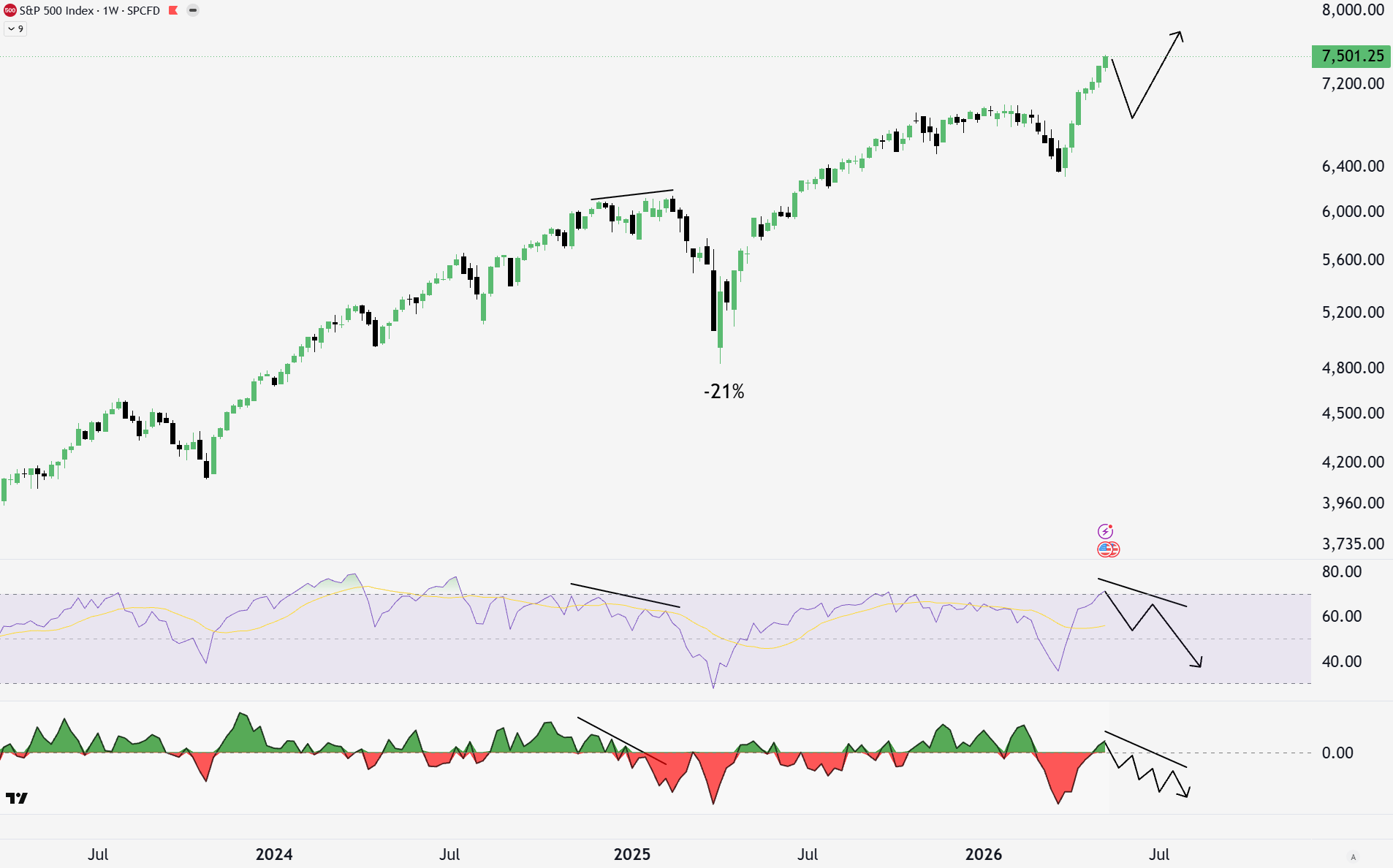
Very few expected the Trump tariffs in 2025 to be as aggressive as they were. That is the narrative behind why the market fell 21%, but the same technicals seen in the chart below were once again warning us.
That brings us to today. There are many reasons to be careful in the current market environment, from fundamentals to technicals. Breadth in the past rally is now positive, but the negative divergence is still there for now. However, this weekly data shows that the negative divergence in the RSI is no longer there. While there doesn’t have to be negative divergence for a top to form, it is a very common feature of the market and human psychology.
This means that the bubble could continue for some time longer. The strength of this move up shifts the probabilities that there is more upside to go. In my drawings below, a pullback with one more high could reestablish negative divergence on both momentum and breadth. This doesn’t have to happen, but it would be more likely (of course, I could also be wrong about everything, and there is no bear market in sight, but unlikely in my opinion).
So we don’t know when the top will be now? Well, for further technical indicators, we can look at relationships between different sectors of the stock market.
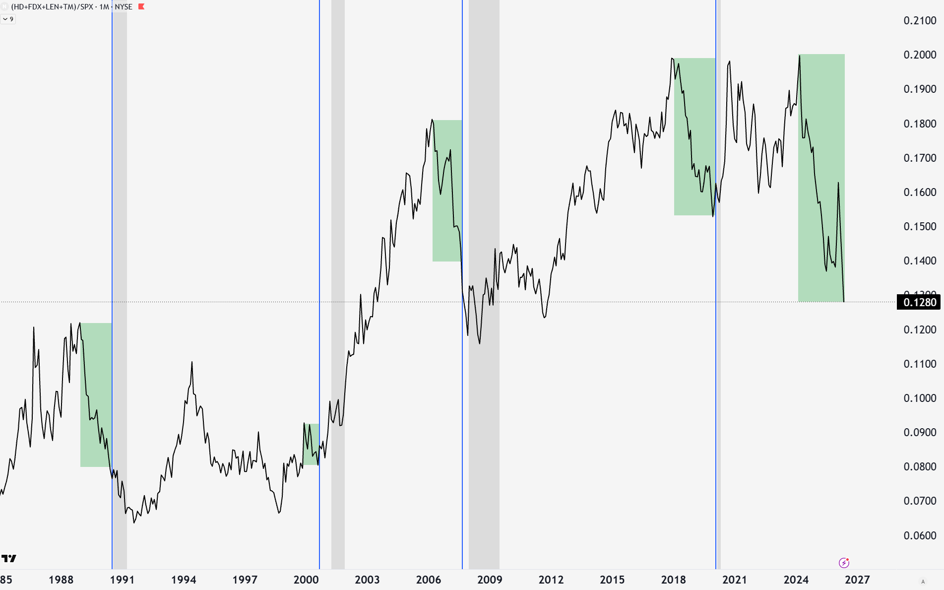
A simple basket of cyclical or discretionary stocks (Home Depot (HD), FedEx (FDX), Lennar (LEN), Toyota (TM)) represents the parts of the economy that move with the business cycle. Housing activity, home appliances, shipping, and car purchases go on hold when consumers are distressed. This typically happens before the official recession hits and is yet another leading indicator of recession and market tops.
In 1989, 2000 (only slightly), 2006, and 2018, these stocks showed incredible weakness relative to the S&P 500 before the market top or recession. Today, these stocks have had a negative thrust as great as any before a major market top and recession.
Consumer staples (XLP) are part of the economy that hold up much better during a recession. Coca-Cola, McDonald’s, Clorox, Johnson and Johnson, and Walmart are some of the names to think of. While they don’t have predictive ability like those above, they offer protection during the recession. Except for COVID, where XLP led and then suffered during the quick V-shape recovery of the general market, XLP outperforms SPX after the SPX tops and dips into recession.
You can see that XLP is generally an unloved sector heading into market tops. This is because these companies are boring and not the high-growth names that drive the market outperformance during bull runs. The AI theme is driving the market and taking a higher share of the index. Historically, given a few years of a bull market and significant undervaluation relative to SPX, XLP becomes attractive.
Despite the narrative that you should be passively buying the S&P500, losing 50% of your money during a bear market severely hampers wealth growth over time. If you own AI stocks, that will be more like 70-80%. Staples are looking much more attractive on a relative basis, and even more so given some of the technical signals that a top is nearing.
The stock market bubble is in a dangerous place, but that doesn’t mean go sell everything. It does mean being ready to get out when key fundamental and technical markers are hit, and perhaps consider some defensive rotation of stocks. To see my model portfolio in action each month, my risk management strategy, and how I position for what I’ve discussed, consider upgrading to a paid subscription.
-Grayson
Like to see these asymmetric opportunities synthesized into a real model portfolio that beats the S&P 500 and avoids major downside risks?
Socials
Twitter/X - @graysonhoteling
Email - thegrayarea55@gmail.com
Archive - The Gray Area
Notes - The Gray Area
Promotions
Sign up for TradingView
For educational and entertainment purposes only. The Gray Area should not be taken as financial advice.
So much of the economy now rests on real estate and stock equity that the government, political animals that they are, will fire up the printing presses to keep it all afloat. It will eventually end badly and the more the inevitable reckoning is delayed the worse it will be, IMO. Japan has managed to pull off delaying the inevitable for decades, though now they have around twice the debt of the US. It all works until it doesn't. At my age, 67, I have to be conservative about playing the bubble---I don't have the timeline to recoup a massive downturn so it's a strange position to be in. Even PMs appear to be trading with the bubble now, though in theory they should buck the trend eventually. Crazy times!