
🔋Technically Speaking
Reading the tea leaves on the stock market.

If you enjoy, press the heart button on this article! I would greatly appreciate it :)

There are many fundamental risks with valuations in the stock market today. With resilient economic growth, record government support, and passive flows adding to the stock mania, it is difficult to foresee major challenges. While markets can remain irrational longer than you can remain solvent, looking under the surface reveals some data points that suggest an ominous future.
Technical analysis is not a data point like I normally discuss but is a method of using price action to manage risk with overbought/oversold levels and sometimes predict future price movements. In the late 1930s, Ralph Elliott developed Elliot Wave Theory, an advanced form of technical analysis that uses a series of impulse and corrective waves to track price action and sentiment in markets. At the time he correctly predicted a 100-year bull market in equities at a time during the great depression when a significant chunk of the population had their wealth destroyed in the stock market or had not seen positive returns in over 10 years.
If you take issue with Elliot Wave or technical analysis that’s fine, but like much of the fundamental analysis I have discussed previously it suggests we are near the end of a generational bull market which will be followed by a large correction. In Elliot Wave, a 5-wave impulse move is followed by a 3-wave correction. Each wave is subdivided into lower-order waves with the same 3 and 5-wave structures. The analysis can be subjective, but on larger time-frames like the monthly chart which I will discuss the analysis is more accurate.
In the figure below, the blue supercycle degrees show we are ending an impulsive wave (III) (out of 5) that began in 1930. Below that, it shows we are finishing a cycle wave V of one lower degree. Since we are expecting the corrective wave (IV) in blue, this is to be on the same scale as the previous corrective wave (II) from 1929, implying we could see a very big move on a similar magnitude to the 1929 crash.
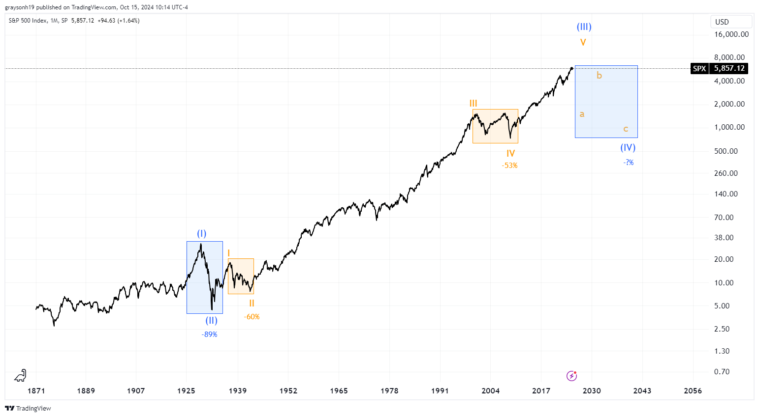
While this may seem sensational and impossible, we can break it down into smaller waves to gain insight. Looking at clues in the smaller cycle wave degree in orange, we can see that WWII, the dot-com bubble, and the 2008 financial crisis are all of a smaller degree even though they constituted 50-60% drops in the market over 9 years. Since we may soon experience a larger wave correction, it should be greater in magnitude and duration than these smaller waves. This means that a 60-90% drop in the S&P500 over 10-15 years is perfectly reasonable. We have been riding the long supercycle wave (III) higher for 94 years now and no one actively trading markets is alive to remember the last wave of this degree.
Corrective waves will be 3 large a-b-c waves down. This means that over the next decade or so we would see a 2008 style drop, followed by what seems like the market is back to the bull market in wave b, only to have a second 2008 style drop in wave c down to the bottom of wave (IV). Targets for this wave are as low as the 2008 low in the 600s. Only at this point after the second drop is the bull market back on.
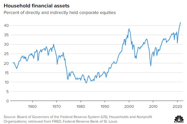
It is important to note that this is a multi-decade wave count and doesn’t mean the top is in. It is possible and likely even that the market could push higher in a blow-off top like 1929. This has crazy and potentially terrible implications though, especially for retirees banking on 401k and other retirement accounts invested in stocks. Further, households are holding record amounts of equities and could lose significant wealth in this outcome.
While Elliot Wave is subjective and this wave count can be argued, it is valid and likely even. Classical technical analysis can also be used to indicate when we are near turning points in markets as well. Using an indicator called the relative strength index (RSI) we can see whether markets have momentum in one way or the other or are in extremely overbought or oversold levels.
Using RSI, we can see that near major turning points there is a negative divergence, indicated by the red/purple trendlines below. Divergence is when the price keeps going higher, but the RSI is flat or trending down (indicating weakness in the move). In 1929 there was a negative divergence during the blow-off top and exuberance that preceded the infamous crash. Leading to the 2000 dot-com bubble peak, there was a negative divergence as well. A larger negative divergence from the 2000 peak to the 2007 peak was also observed, preceding the large drops. That brings us to today, where there is a very clear negative divergence from 2018 to today which is another warning sign of a looming top.

These warnings sound extreme and frankly are. Whether you brush technical analysis off as mumbo jumbo or are intrigued, it is yet another indication to be mindful of the risks ahead. Just like the fundamental story paints a picture of a looming recession and an overvalued stock market, the technical picture is not rosier. I am not trying to be a doomer and the party in stocks can continue for some time longer, but it is important to be mindful of the potential avenues that you want to avoid and not be caught blindsided too. Until next week,
-Grayson
Leave a like and let me know what you think!
If you haven’t already, follow me at TwitterX @graysonhoteling and check out my latest post on notes.
Socials
Twitter/X - @graysonhoteling
LinkedIn - Grayson Hoteling
Archive - The Gray Area
Let someone know about The Gray Area and spread the word!
Thanks for reading The Gray Area! Subscribe for free to receive new posts and support my work.
I think you are right. Question is, if everything starts to topple will the Fed overextend itself yet again and really put us into the depths of debt by propping up the markets. That could push the top further into the decade. I thought we were forming the dreaded double top of late but if the markets keep going higher (Dow @ 42K!) that double top may wash out.
Correction, 43K for the Dow, lol.