

If you find this article interesting, click the like button for me! I would greatly appreciate it :)

The stock market is expensive, no matter which way you look at it. From cyclically adjusted price-to-earnings (CAPE P/E) to the S&P 500 market cap to GDP (Buffett indicator), the market is at extremes. The CAPE ratio shows us price to the past 10 years of earnings, to smooth out noise and volatility. The downsides to this approach are that the data is backward-looking and new behaviors can cause long-lasting changes to earnings like stock buybacks, new paradigms, or accounting changes. Nonetheless, in conjunction with other methods shows the long history of valuations in the S&P 500.
Going all the way back to 1877, extremes in the CAPE ratio follow a rough 30-year cycle for both peaks and troughs and consistently precede reversals to the other extreme. For a variety of factors, there is a rising trendline in valuations over time. Not every reversal is to the channel extreme, and some are only moderate extremes, like the 2008 financial crisis or late 1960s bubble top. While we are near the highest levels ever recorded (1929 and 2000), there technically is more room to run if we are going to hit the upper trend line. This is the bull case for a few more years of AI Mania.
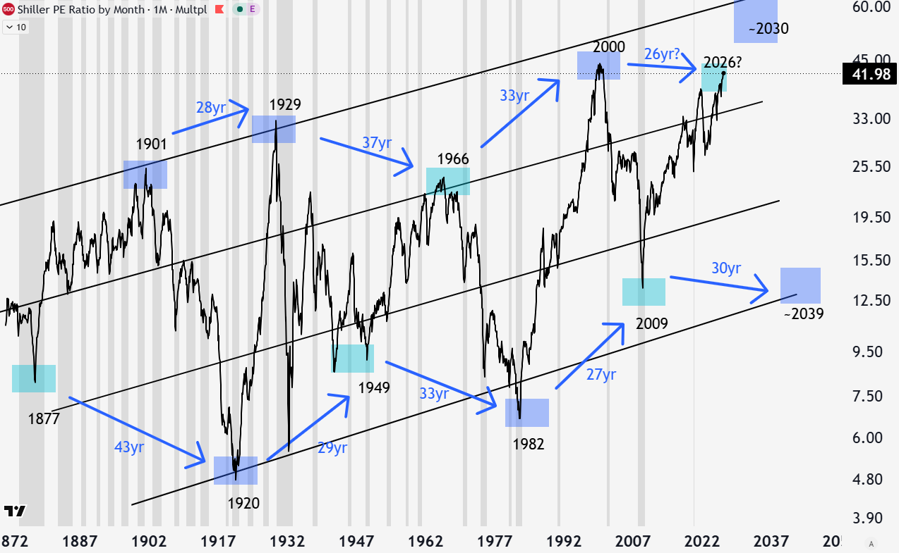
Some suggest that since forward-looking P/Es are really low, AI is not a bubble and valuations are overstated. I take the complete other side. Earnings are the actual bubble, as I’ve argued in Written Off. If true, the CAPE ratio understates the extremity of valuations. Regardless of this stance, the long-term CAPE P/E is historically expensive, which tends to produce a forward 10-year annual return below average.
Taking the CAPE and flipping it gives what’s called the earnings yield of the S&P 500. This is thought of as what percentage return the market earnings represent on your purchase price. This is the same chart as the one above, just flipped. You can also see the extreme readings today, in 2000, and 1929.
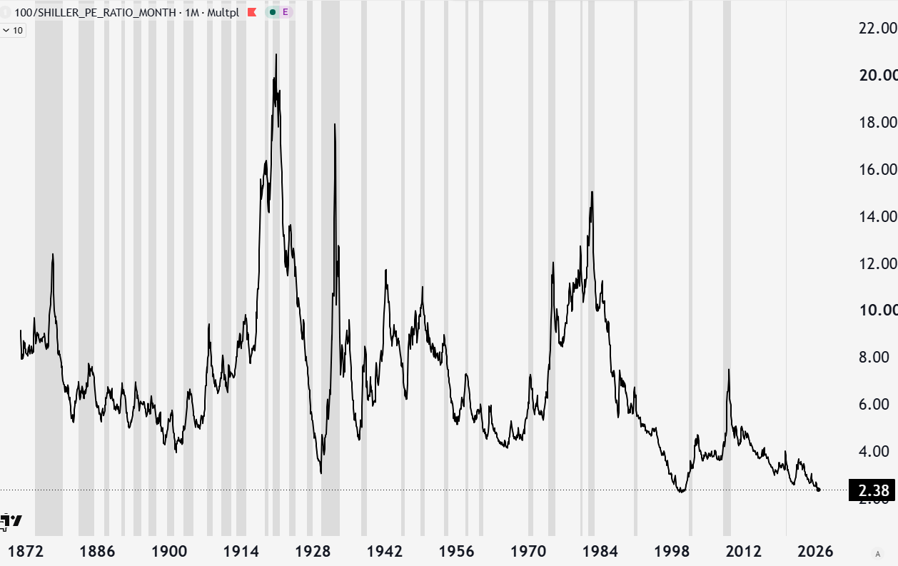
If stocks are probabilistically worse over the next 10 years, are there alternatives? The main alternative is bonds, and for much of history, bonds were the dominant investment class over equities. Today, that is an unthinkable world, but not so fast. If we are thinking about valuations and their probabilistic relationship to future 10-year returns, we can directly compare that to a bond of the same duration.
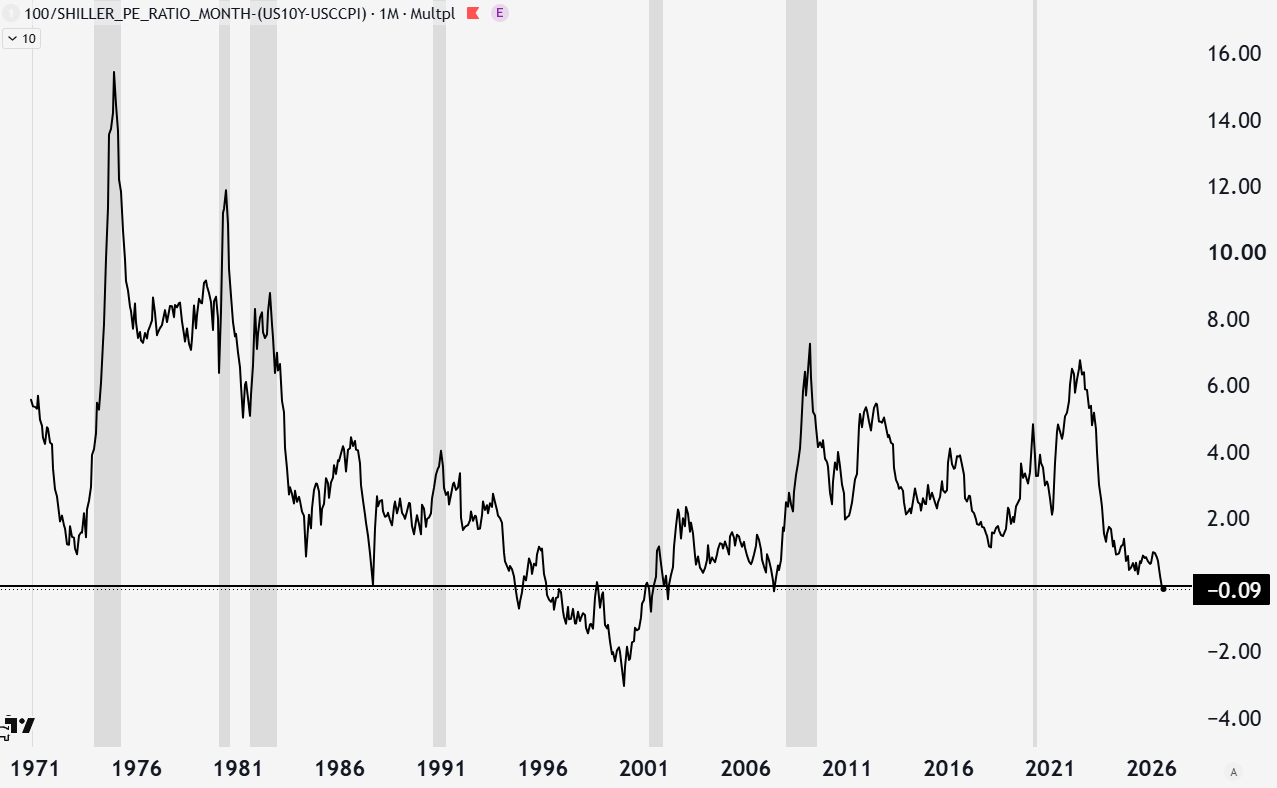
Everyone knows that stocks typically outperform bonds; this is because of the excess risk you take. This is measured with the equity risk premia. Adjusting the US 10-year Treasury bond for inflation, you can compare the real bond yield to the S&P 500 earnings yield. If the excess risk you take is zero, it doesn’t make sense to own stocks. In other words, you are not being compensated by stocks for the excess risk over owning bonds. This is the exact scenario we are in now. Excess yield from stocks is negative, like it was before the dot-com bubble, meaning you are paying a premium to own stocks over bonds in the current environment.
You may say, so what? The forward earnings of these companies are amazing, meaning the economy is growing and doing great. As long as this is the case, stocks are fine. Are they?
Nominal GDP (nGDP) represents economic growth (GDP) + inflation. The 10-year treasury roughly represents nominal GDP in the long run. First, with nGDP decreasing, this is a sign that the economy is slowing and potentially on its way to recession.
Second, after the pandemic was the “run it hot” economy, with nGDP higher than bond yields. In this environment, debt-financed economic activity pays for itself easily. Oftentimes debt/GDP ratios go down, and debt service is not burdensome. Over the long run, this would be great for governments with large debt burdens, and relates to financial repression.
On the other hand, nGDP less than bond yields is the opposite. Interest costs compound faster than the revenue base servicing them, so debt/GDP rises. This makes it difficult for anything that depends on outgrowing its financing cost, like government deficits, corporate leverage, and typical growth investments.
This is the environment we are entering. Run it hot (nGDP>bond yields) was good for our tech-dominated markets, made financing easy even with elevated rates post 2022, and supported asset prices and economic growth. Entering an environment with increasing headwinds (nGDP<bond yields) makes debt more difficult to justify and service, and makes growth investments look less attractive.
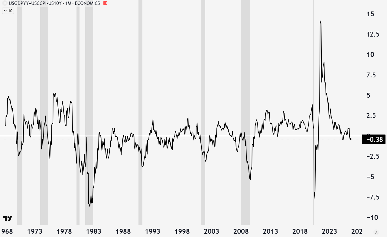
A subtle nuance in this relationship is that nGDP lags forward-looking yields. Yields are a real-time, forward-looking summation of all market participants. GDP and CPI data from the government are inaccurate and lagging. This is why you don’t look at GDP to see if a recession is coming, but at the credit markets. Before a recession, bond yields will fall in the quarter or two before the recession as expectations of lower growth and inflation are apparent to investors but have not been borne out in the GDP data. Before 2000 and 2008, you had a brief upward relief in this data set before things hit the fan, as the bond market saw the recession coming even though a rising line in this graph looks good.
From a technical perspective, bonds were in a multi-decade bubble that popped in 2020. The chart below is TLT, which shows the price, which is inverse of the bond yield (if bond yields we’ve been discussing go lower, bond prices and your investment go up). Since then, we have seen an impulsive move lower (circle 1-5) followed by a corrective sideways move within the wedge. Corrections are typically a 3-wave (abc) countertrend move. My primary path is a (C) of b move higher into the 100-110 area, which would correspond with a recession.
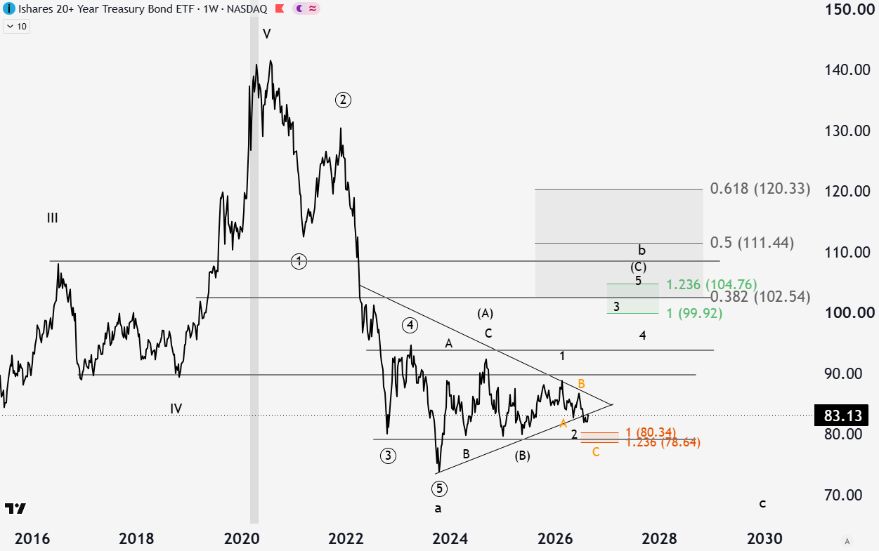
That thesis is corroborated by the elevated asset prices, underloved bond market, and yield relationship between the two. The thesis is also being stressed right now with an apparent breakdown from the triangle in TLT. We wait and see if the breakdown on TLT (breakout higher in yields) is persistent or a trap.
In addition to nominal bonds, inflation-protected bonds (TIPS) are an asset I’ve written about as similarly attractive. In a world where inflation and government financial repression are a longer-term issue, TIPS are great safe protection. Yields on TIPS are similarly attractive to nominal bonds but carry liquidation risk during a credit event, unlike nominal bonds, which stand to benefit from that scenario.
Conclusion
Everyone is concerned about bonds right now because inflation and growth expectations are strong. People think that the debt and money printing are causing bond investors and foreign nations to not want US Treasuries to the same extent. A contrarian investor would look at the seeming breakout in bond yields, extreme sentiment, and extreme short interest and view this as a good time to buy. The fears of money printing and inflation may be true over the long run, but a credit issue and recession can meaningfully disrupt those plans.
In general, earnings yields to bond yields are telling a story that stocks are not paying you as much as the safety of government treasury bonds. Further, the growth narratives of the economy are going in the wrong direction, now providing headwinds to the hyper-growth story relative to financing costs. Boring old bonds might just be the best place to be. Until next week,
-Grayson
Like to see these asymmetric opportunities synthesized into a real model portfolio that beats the S&P 500 and avoids major downside risks?
Socials
Twitter/X - @graysonhoteling
Email - thegrayarea55@gmail.com
Archive - The Gray Area
Notes - The Gray Area
Promotions
Sign up for TradingView
For educational and entertainment purposes only. The Gray Area should not be taken as financial advice.
That's a frightening thought, that this bull market could still run a few more years---in that the longer the rubber band gets stretched the hard it snaps back. But yes bonds sound like the place to be in this Kobayashi Muru environment.